Sankey chart
Visualize flows between categories, from sources through to targets
Beta We'd love your feedback on Sankey charts as we continue to improve them. What Beta means.
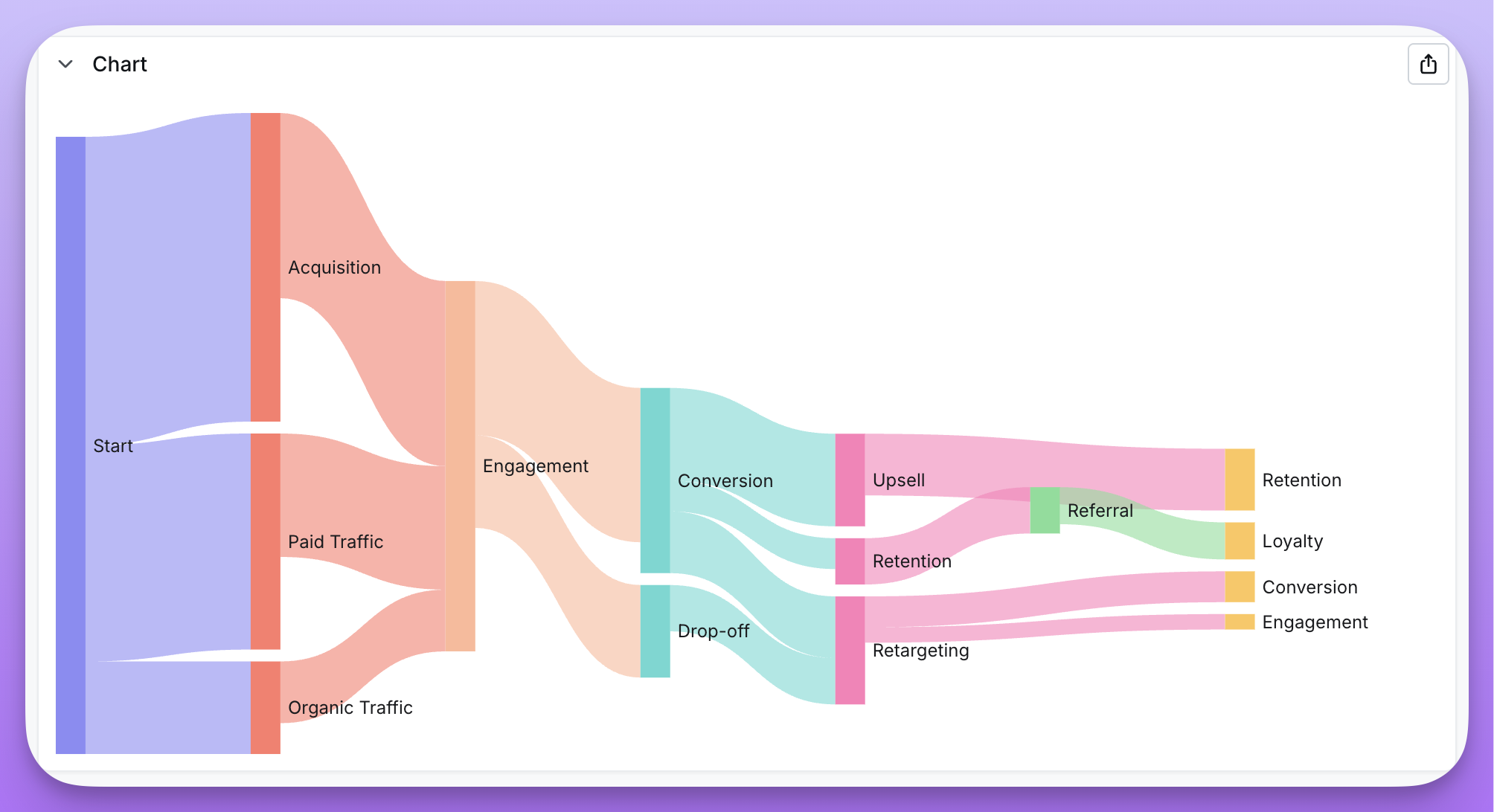
Sankey diagrams visualize flows between categories — how values move from a source to a target, weighted by a metric. They're ideal for understanding movement, distribution, or conversion across stages.
Sankey charts are useful when:
- You want to show how values flow between categories (e.g., marketing channels → conversions)
- You're visualizing multi-step processes or funnels
- You need to understand distribution across interconnected stages
- You have cyclical flows that loop back (e.g., retargeting → conversion → retargeting)
Data requirements
Sankey charts require three columns in your data:
| Column type | Description | Example |
|---|---|---|
| Source dimension | Where the flow originates | channel, referrer, stage_from |
| Target dimension | Where the flow goes | conversion_type, destination, stage_to |
| Weight metric | The size of the flow | count, revenue, users |
Each row in your data represents a flow from one node to another, with the weight determining the thickness of the connection.
Creating a Sankey chart
- Run a query with your source dimension, target dimension, and weight metric
- Select Sankey from the chart type picker
- In the configuration panel, assign:
- Source — the dimension representing flow origins
- Target — the dimension representing flow destinations
- Value — the metric determining flow size
Features
Multi-step flows
Sankey charts automatically handle nodes that appear as both sources and targets, creating multi-level visualizations. For example, if "Email" appears as a target from "Ad Click" and as a source to "Purchase", the chart will show the full flow path.
Cyclical flows
Unlike traditional Sankey implementations, Qyra supports cyclical data where flows can loop back. For example, in a retargeting funnel:
- Awareness → Consideration
- Consideration → Conversion
- Conversion → Retargeting
- Retargeting → Conversion (loop)
The chart handles these cycles by creating step-suffixed node instances (e.g., "Conversion - Step 2").
Node layout
The Node layout option controls how a label that appears at more than one depth is rendered. For funnels where a single stage is reached from several preceding steps, the default can make one real stage look like several different nodes, so you can choose between three layouts:
- Multi-step (default) — Each occurrence of a label at a different depth is rendered as a separate node, including cycles, which become "Step N" instances as described above. This preserves the full journey.
- Merged — Collapses nodes that share a label into a single node, so all flows in and out of that label converge on one node while the multi-step journey is preserved. Available for acyclic flows only; when your data contains a loop the option is disabled and the chart falls back to multi-step.
- Direct — Shows only direct source → target flows in two columns, with no multi-step chaining. A label that is both a source and a target appears once on each side. This works for any data, including cyclical flows.
Display options
- Orientation — Display flows horizontally (left to right) or vertically (top to bottom)
- Node alignment — Align nodes to the left, right, or justify across the chart
- Node layout — Choose how nodes are arranged: Multi-step (depth-based journeys, the default), Merged (one node per label, acyclic flows only), or Direct (two-column source → target only)